This was an interesting little discussion paper about two topics that I hold dear: my disdain for traffic light reporting indicators, and my massive love for anything Deming-related (seriously, Deming was a genius and his insights in my opinion are just as relevant now as they ever were).
This looked at the misuse of traffic lights in tracking performance measures in hospitals and provided some worked examples.
First they note that, at least in Denmark, hospitals have a bottom-up approach to developing their own relevant performance indicators. However, the author’s take issue with the widespread use of red, amber, green approaches in their organisation to track performance.
The authors don’t mince their words, saying “The problem with red, amber, green management is that at best is it useless, at worst it is harmful” (p81).
They provide an example of a monthly count of unwanted events via traffic lights (below). Notably, the graph “fails to convey a very important message while at the same time suggesting a false message” (p82). First, it doesn’t indicate the role that chance plays in month-to-month variation and instead is suggesting that different causes are contributing to red and green results.
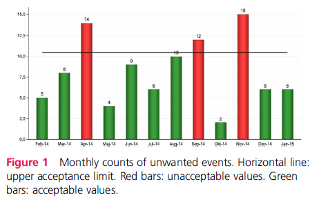
In their view, “this often leads to actions being taken on red results, while green results are left alone or even celebrated” (p82). Problematically, if the red and green variation are all products of the same random process then this strategy is said to be pointless and akin to “tossing a coin and celebrating heads as achievements of a skilled coin tosser while castigating tails” (p82).
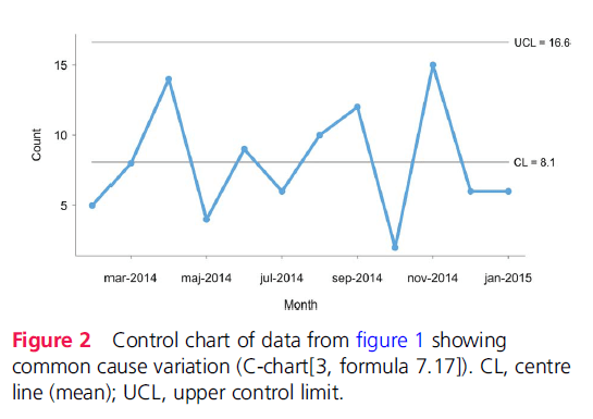
Importantly, they highlight the contrast of that figure with plotting the data on a control chart (second image below). By plotting the control chart, the monthly variation of incidents are within the control lines and indicative of common cause variation (the more natural, inherent variation within a system and perhaps not necessarily linked to an unusual functioning of the system).
In their view, there’s no reason to suspect that the 3 months of incident data above the target (including the red on the traffic system) are representative of special cause variation, and thus we have no strong reason to conclude that this performance is statistically different to any other time period over the chart.
This misdirection risks taking separate action on things which may not need attention, and this on-off pattern of reacting to problems that are common cause (rather than special cause) may increase system variation, as highlighted by Deming’s work.
Furthermore, on-off reactions to incidents may lead to change fatigue among staff, who repeatedly are involved in initiatives or changing procedures and routines without any overall change in performance.
They further discuss the importance of understanding common vs special cause variation, since they may require different improvement strategies. In short, special causes should be investigated, understood and damping variation before moving to stabilise common cause variation.
Traffic light systems, which may be devoid of this underlying logic, may be “pointless, potentially harmful and responsible for much of the improvement fatigue that is present in … organisations” (p83).
They provide a further worked example of hospital waiting times over a period of time. By using a control chart and dividing the time period into specific parts, they argue that it now provides more context and use for decision making, where more clear insights about common cause and special cause variations are evident. In their example, confusing the special cause variation which influenced waiting times during a vacation period as common cause, and thus implementing common cause variation interventions, could have introduced a negative effect.
In discussing the application of control charts, the authors find feedback (from managers, professionals etc.) interesting: namely, it’s perceived to be complicated and ill-suited for use across industry. Interesting because this apparently complicated tool was “developed and successfully used to help unschooled assembly line workers control production processes in the 1920s” (p83).
Second, although it may seem more complicated and less intuitive than traffic lights as a long-term strategy, continuing to use traffic lights may continue the cycle of confusion and poorly calibrated initiatives.
Third, taking action against variation without better understanding that source of variation is pointless and potentially harmful.
In concluding, they say that control charts can still fill a need for simple displays of data, where “It is no more complicated to tell special from common cause variation than it is to tell red from amber and green”.
Personally, I use control charts (and other statistical means) a lot and think they have considerable value. In one way they can help prevent knee-jerk reactions to apparent spates or trends of incidents, which according to a graph look intuitive, but statistically, cannot be justified against normal month-to-month variation.
Link in comments.
Authors: Jacob Anhøj, Anne-Marie Blok Hellesøe, BMJ Qual Saf 2017
Study link: http://dx.doi.org/10.1136/bmjqs-2015-004951
Link to the LinkedIn article: https://www.linkedin.com/pulse/problem-red-amber-green-need-avoid-distraction-random-ben-hutchinson

Important paper Ben, thanks for sharing. I’m a big fan of Deming’s writings and also those of one of his students, Donald Wheeler. Here’s an interesting paper about traffic statistics. https://www.spcpress.com/pdf/DJW157.pdf
LikeLike
Thanks for that – nice paper and example of how control charts can help inform better intel.
LikeLike