Here’s one of many articles providing suggestions on improving risk matrices (RMs).
Link to full article in comments.
Note:
A) There’s lots written on this topic (e.g. dozens of such articles and I have a textbook focusing purely on RM design which I’m working out how to summarise); so this article won’t cover every relevant facet.
B) I’m not necessarily endorsing this approach; just sharing.
Some points:
· RMs “suffer from shortcomings that can lead to non-meaningful results and oversimplified classification”
· Typical green-yellow-red colour schemes are questioned due to their lack of perceptual uniformity and inaccessibility for people with colour vision deficiencies
· They talk about Cox Jr’ work, whom “pointed out (and mathematically proved) that typical risk matrices do not fulfil their purpose of supporting good project management decisions”
· These issues include poor resolution, errors in assignment of risk ratings, suboptimal resource allocation and ambiguous inputs/outputs, range compression and more
· One limitation is that if scales aren’t defined specifically with numbers (values, percentages, frequencies etc.) then “arbitrary results are likely to occur due to the ambiguous nature of the scale”
· They suggest that quantitative scales are preferred over semi-qualitative. If unavoidable, then sticking with qualitative (high, low) scales are preferable; ensuring that the meaning of each word, e.g. ‘low’ are defined
· They argue that risk “is not per se the product of probability and consequence. In fact, the two variables are independent”
· And only if it occurs will a consequence follow, and treating them independently is preferable (see the article for the explanation)
· They discuss a “major flaw of risk matrices” being range compression. An example is given where a USD 50 billion blowout with a low probability led to a lower risk rating than other risk events with higher probabilities, but consequences in the range of millions
· These “results are obviously artefacts produced by range compression where risk categories do not reflect the ranges needed for the specif ic purpose, i.e. a USD 50 billion blowout must not have a risk rating of 5 (probability 1, consequence 5) on scale from 1-25 if there is even the slightest possibility of this risk to occur”
· They suggest that non-linear scales will normally be more useful than linear, but for larger ranges log scales are an option
· They argue that the context matters, and no single risk matrix may fit all contexts
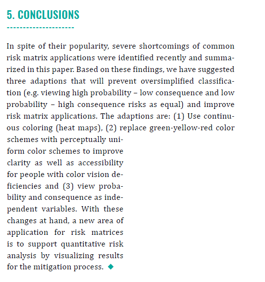
· They discuss adaptations to the RM, being 1) use continuous colouring (heat maps), 2) replace green-yellow-red colour schemes, 3) view probability and consequences as independent variables

Ref: Entacher, M., & Sander, P. (2018). Improving risk matrix design using heatmaps and accessible colors. The Journal of Modern Project Management, 6(1).
Study link: https://journalmodernpm.com/manuscript/index.php/jmpm/article/download/JMPM01604/300
My site with more reviews: https://safety177496371.wordpress.com

One thought on “Improving risk matrix design using heatmaps and accessible colors”