This book chapter explored research on the design and efficacy of written warnings and hazard communications, like you’d find in product information booklets, labels etc.
It’s a whole chapter, so I can only touch on some points.
First they say that, overall, safety warnings are a “third line of defense behind design and guarding”, they shouldn’t be considered for the first time after the design phase and after the product has been set and established.
Problematically “Too many warnings are developed at this late stage of design, as an afterthought, and their quality and effectiveness often reflect it”
Warnings that are also based on unrealistic and untested assumptions or expectations about the target audience are unlikely to be as effective as they could be.
Several principles guide when a warning should be used, including:
1. A significant hazard exists
2. The hazard, consequences or appropriate safe modes of behaviour aren’t known by the target audiences exposed to the hazard
3. The hazards aren’t open and obvious, e.g. “the appearance and function of the environment or product do not convey them”
4. Reminders are needed to assure awareness and comprehension of the hazard at the proper time – and more so during situations of high task loading or potential distractions

They discuss the C-HIP model of communications, which describes several stages of cognitive and mental processing around communication. I’ve skipped most of this discussion, but it’s used as a guiding framework to discuss hazard warnings.
It’s said that warning information is processed at each stage of the model, and if processing at a stage is unsuccessful then a bottleneck is created. While processing of the warning might not make it all the way trough to the final stage, it might still be successful at influencing earlier stages.
E.g. A warning may influence comprehension of the hazard but not change actual behaviour downstream. In this situation, the warning isn’t totally ineffective since it produced a better understanding of the issue, even though it didn’t directly change behaviour, and, in theory, allows a higher potential to create different action.
The C-HIP model can also be helpful to diagnose and understand warning failures and inadequacies. They next cover the stages of the model in the context of warnings – I’ve skipped a lot.
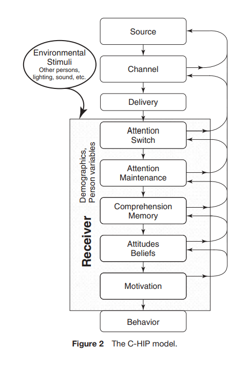
1. Source
This is the originator or initial transmitter of the warning info. Differences in the perceived characteristics of the source can influence a person’s beliefs about the credibility of the warning info. E.g. Info from reliable expert sources like the Surgeon General or FDA generate greater credibility. Internet users are more likely to believe info from websites that have domain suffixes like .edu or .gov, because they are seen as educational or governmental sources, compared to for-profit companies.
2. Channel
This is the medium which the info is transmitted from the source to the receivers.
In the past, most warnings were presented on product labels, posters or brochures. These methods are said to be ‘static’ displays, and can be enhanced via dynamic displays. E.g. use of computers and sensors to process info to enable tailored and time-sensitive warnings for the situation at hand.
Warnings are often sent via visual channels and auditory (alarms). Sometimes smell is also used, like in some gases.
3. Media and Modality
Here it’s said some research has explored whether presentation of a language-based warning is more effective when presented in visual (text) or auditory (speech). Results tend to be conflicting. Other research suggests that longer and more complex messages may be better presented visually, whereas shorter messages auditorily.
Auditory channels are “usually better for attracting attention (a stage described below). However, auditory presentation can be less effective than visual presentation, particularly for processing lengthy, complex messages”.
4. Multiple Methods and Redundancy
Research suggests that presenting warnings in two modalities is better than a single channel. E.g. using a visual display while at the same time the same info is given orally or other. Again, I’ve skipped over a lot of details.
5. Direct and Indirect Communications
There are direct and indirect effects of warnings. Direct effects occur when the intended person is directly exposed to the warning – e.g. they can directly experience it.
Warnings can also serve purposes when indirect though. For instance one study found that “the indirect effects associated with alcoholic-beverage warnings may explain gender differences in the likelihood to intervene to prevent others from driving while intoxicated”.
Another example of where indirect effects was considered in warning design was a herbicide, which targeted the Spanish-speaking labourers in US agriculture by providing English and Spanish on the warnings.
They say “In the design of warning systems, empowering indirect warnings could enhance the spread of warning information to relevant targets”
6. Receiver
This focuses on the receiver of the warning, generally the targeted or intended audience.
They say that for a warning to be effective and thereby influence hazard awareness, comprehension and behaviour, attention must be switched to the info for long enough to extract the necessary info.
It must also be understood and “must concur with the receiver’s existing beliefs and attitudes”. Importantly, “If there is disagreement, the warning must be sufficiently persuasive to evoke an attitude change toward agreement”. The warning must also motivate the receiver to take some sort of action.
7. Attention switch
Attention switch is another stage in the human info processing portion of C-HIP. An effective warning “must initially attract attention. Often this attraction must occur in environments where other stimuli are competing for attention”.
Before a warning can capture attention it must first be available to the recipient. Warnings won’t have a direct effect if they aren’t received. The warning must also be present, sufficiently salient—“conspicuous or prominent”. Warnings have to frequently compete for attention, and this is where design factors can influence how well they compete.
8. Size and contrast
The chapter covers a few areas of size, contrast, colour and other design elements. I’ve skipped a bit here.
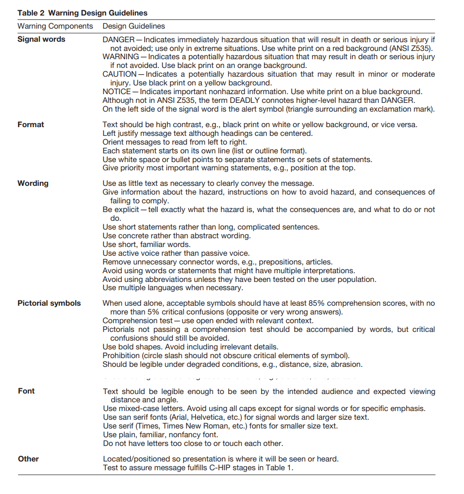
But, generally, bigger is better. Larger print size and contrast against the background have been shown in research to benefit subsequent recall, as did printed warnings looking bigger and bolder, aiding comprehension and memory recall.
Context is also important – not just the size of the warning, but also its size relate to other info on the display. E.g. “A bold warning on a product label where there are other informational items in larger print is less likely to be viewed than those larger items”.
9. Colour
Generally good use of colour aids warnings on their ability to attract attention, despite some considerations of colour blindness, fading and lack of contrast. Colouration can “help a warning attract attention more effectively than a warning that is the same color as its surroundings”.
10. Pictorial symbols
Not surprisingly, pictorial symbols and icons can be useful for attracting attention. For instance, the alert triangle icon is relatively well-known, simple in principle, and effective.
Some research indicates that people prefer warnings with a pictorial symbol over warnings without one.
11. Placement
Here “A general principle is that warnings located close to the hazard both physically and in time will increase the likelihood of a proper attention switch”. For instance, a warning on a battery about hydrogen explosion risk is more likely to be effective than the same warning in the car’s manual.
Warnings ideally should be placed before or above the instructions, and shouldn’t be buried in the middle of other text. An earlier study showed that “warnings in a set of instructions for mixing chemicals were more likely to be noticed and complied with if placed before the task instructions than following them”.
12. Formatting
Aesthetically pleasing warning text with “plenty of white space”, and coherent info groupings is more likely to be effective.
13. Repeated exposure
Repeated and long-term exposure to warnings may result in a loss of attention capturing ability. Habituation can occur over time, even with well-design warnings. They suggest changing a warning’s format or content where feasible, as this may attenuate some of the habituation effect.
14. Auditor warnings
These are often used to attract attention. They’re usually omnidirectional, so the receiver doesn’t have to be looking at a particular location to be alerted.
However, their success in capturing attention is primarily a matter of salience. Auditory warnings “should be louder and distinctively different from expected background noise”.
15. Sensor technology
Sometimes, hazards or warning signs are “outside the range of human sensory perception, leaving persons at risk unaware of the danger without some additional means of detection”.
They cite carbon monoxide gas, as in its pure form it has no odour. Technology enables sensors capable of detecting some of these hazards or warnings.
16. Attention Maintenance
Here they say that while individuals may notice a warning, they may not actually stop to examine it. Warnings that attract some attention but fail to capture it long enough for people to extract the info, or encode its warnings for long enough may have little direct value.
Attention “must be maintained on the message for some length of time to extract meaning from the material”. I’ve skipped the examples.
17. Hazard connotation
Hazard connotation is the concept that some aspects of a warning convey some level or degree of hazard. “It is an overall perception of risk, a subjective understanding of the danger conveyed by the warning components”.
For instance, DANGER should be used for hazards where serious injury or death ‘will’ occur if the warning isn’t adhered to – e.g. working around high voltage aparatus. WARNING is used when serious injury might occur, e.g. working with hazardous chemicals with a burn risk.
It’s said that research “shows that lay persons often fail to differentiate between CAUTION and WARNING, although both are interpreted as connoting lower levels of hazard than DANGER”.
NOTICE is used for conveying important info, but not necessarily relating to injury.
Other research shows that DEADLY carries a connotation of significant hazard above DANGER in some contexts.
Different characteristics of sounds can also lead to different hazard connotations. E.g. higher frequency/pitch and higher amplitude sounds, which have faster repetitions, are perceived as more urgent.
18. Competence
Behaviour is said to sit on the opposite end of the model. If special skills are necessary for heeding a warning, then those skills must be present in the receiver population.
They note that “It is not difficult to find examples of warnings that violate considerations of people’s limitations”, like solvent warnings indicating ‘Avoid breathing fumes’. This warning may be difficult to carry out: can people even detect the fumes? Will those receivers have the necessary PPE or equipment to safely handle the solvents?
19. Message content
The warning content “ should include information about the hazard, the consequences of the hazard, and instructions on how to avoid the hazard”.
20. Hazard information
They say that the point of giving hazard info is to tell the target audience about potential safety problems, e.g. Toxic vapours.
The hazard should be clearly spelled out. An exception may be when the hazard is generally well known by that population, known from previous experience, or is ‘open and obvious’.
21. Consequences
Hazard and consequence info are usually closely linked in the sense that one often leads to the other. Warnings are often sequenced in a specific order, like “Toxic Vapour, Severe Lung Damage”. In other instances it’s more desirable to put the consequences near the beginning of the warning in order to capture and hold the receiver’s attention, “Severe Lung Damage, Toxic Vapour”.
It’s argued that the latter is particularly salient for severe consequences involving death, paralysis and severe lung damage.
They cite some other examples. Like, “Wet Floor” probably doesn’t need a consequence statement like “You could fall”, since it’s “reasonable to assume that people will correctly infer the appropriate consequence” (see the prior exceptions like the hazard/consequence is well-known and open and obvious”).
In any case, this warning could be improved by saying something like “Slippery”, instead of Wet, so it includes the consequences.
This “lack of specificity is a shortcoming in many warnings”. Warnings often fail to include important details. Take “May be hazardous to your health” regarding a toxic vapour product. This warning doesn’t tell the receiver whether they “may develop a minor cough or suffer severe lung damage”.
22. Instructions
Warnings should not only capture and hold a receiver’s attention and convey info, but should also instruct them what to do or not to do to stay safe. Often, but not always, instructions follow after the hazard and consequence info.
23. Explicitness
Generally, warnings should be specific over general. Explicitness is relevant here – these messages contain info that is “sufficiently clear and detailed to permit the receiver to understand at an appropriate level the nature of the hazard, the consequences, and the instructions”.
For example, “Use with adequate ventilation” doesn’t indicate whether opening a window ,or using a fan is adequate, or whether it’s more specific like a volume of air flow per unit time. This instruction isn’t clear, and this is a frequent issue.
They cite two vague-ish examples. 1) “Dangerous Environment, Health Hazard, Use Precautions” versus 2) “Mechanical Hazard, Injury Possible, Exercise Care.”
Improvements may be: “Severe Lung Damage, Toxic Chlorine Vapor, Must Use Respirator-Type 123”.
24. Habituation
As noted, habituation may occur over time or due to repeated exposure to the warning, and this effects even well-designed warnings.
There’s no simple or universal way to counter this effect. One approach is to use attention-grabbing features as described in this chapter, which may slow habituation.
Varying warnings periodically may have utility – and they cite the rotation of smoke packet warnings.
25. Warnings as reminders
There is a distinction between awareness and knowledge. People may have knowledge about a hazard, but may not be aware of it at a particular time. They use an analogy between short-term and long-term memory.
That is, “people may have information or experience in their overall knowledge base, but at a given time, it is not in their current awareness—or what they are thinking about”.
Knowing something isn’t enough, but people need to also be aware of that info at a particular time under particular circumstances.
They cite the following example: “No one knew better than the three-fingered punch press operators of the 1920s that their hand should not be under the piston when it stroked, but such incidents continued to occur”.
Warnings as reminders can be useful, like:
1) When a hazardous situation or product, that isn’t open and obvious, isn’t encountered frequently, or when forgetting may be relevant
2) When distractions may occur during the performance or a task or use of the product, or in environments where environmental stimuli compete for attention
3) During high task loads which exceed attentional capacity, limiting access to the salient info
26. Beliefs and attitudes
Even if people notice a warning and have their attention captured for ong enough, it might still fail to elicit the intended actions due to “discrepant beliefs and attitudes held by the receiver”.
27. Risk perception
Whether people read and comply with warnings, as with the factors mentioned before, also relate to their perception of the level of hazard and consequences.
The greater the perceived hazard and consequences, the more responsive people will be to the warnings generally.
Conversely, “Persons who do not perceive products as being hazardous are less likely to notice or read an associated warning”. A perceived hazard is also related to the expected injury’s severity level – with greater perceived injury potential, the more hazardous is the product perceived.
[** Also, if a product is perceived as more useful or more positively perceived, people may likewise perceive the hazard or risk to be lower, which may be inconsistent with the statistical risk]
Hence, “Even if the warning is read and understood, compliance may be low if the consequence is believed to be low”.
28. Cost of compliance
Cost of compliance also needs to be considered. Usually, compliance with a warning requires some sort of action on the receiver’s part, e.g. time, effort, money or more.
Here, “When people perceive the costs of compliance to be greater than the benefits, they are less likely to perform the safety behavior”.
One way of reducing the cost of compliance is to make the directed behaviour easier to perform. Like, if gloves should be used then including them with the product. A general rule is “that safe use of a product should be as simple, easy, and convenient as possible”.
Also, the ‘costs’ of noncompliance should also be communicated, particularly with dangerous outcomes. For instance, “Can cause liver disease—a condition that almost always leads to death” provide reasons for complying and are preferred to general, nonexplicit statements such as “Can lead to serious illness”.
Next the paper provides some suggestions. In conjunction to the below image, they have provided principles of warnings.
1) Be brief and complete – brief as possible, but with necessary information
a. Overwarning is a consideration here. That is, providing too much information of warnings, which drowns out critical info. Conversely, another argument counters this by saying that the info should be provided nevertheless
2) Prioritisation – which cover which hazards to warn about and what to emphasise. This should include likelihood, severity, whether the issue is known or unknown to the target population, important for the individual to know, and the practicality
a. Here they say ”As a general rule, unknown and important hazards leading to more severe consequences and/or those more likely to occur should have higher priority than less severe or less likely hazards”
3) Know the receiver – involving gathering data on the receiver characteristics, demographics etc.
4) Design for low-end receiver – here they argue that designing for averages / medians (e.g. median/mean population literacy) may omit people at the lower end; hence safety-critical warnings should be pitched at a lower target group of comprehension
5) Warning system – consider warnings at different levels, using different means
6) Durability – this relates to how long the warning will last in its environment, e.g. weathering effects
7) Test the warning – carry out some type of evaluation with the target groups
Ref: Wogalter, M. S., Mayhorn, C. B., & Laughery Sr, K. R. (2021). Warnings and hazard communications. Handbook of human factors and ergonomics, 644-667.
My site with more reviews: https://safety177496371.wordpress.com
LinkedIn post: https://www.linkedin.com/pulse/warnings-hazard-communications-ben-hutchinson-vp9wc

One thought on “Warnings and Hazard Communications”